Client
KTH Royal Institute of Technoogy
Role
UX Design Consultant
Industry
Education
Date
2024
Project Overview
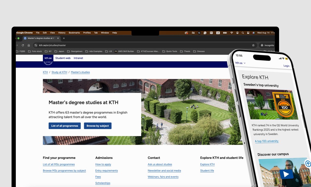
The website (kth.se) should provide all information needed to convert a qualified applicant without any assistance.
Further, it should provide all information needed for an unqualified applicant to understand that they do not qualify. Lead prospective students through the information they need to decide on studies at KTH, and finally convert and give a clear and consistent image of KTH that is reflected in all text, images, videos and visuals.
Design Methodology
I approached this project based on Design Thinking methodology, by developing assumptions and finding answers for the digital problems current and former students encountered when interacting with the website, while aligning the design with the institution objectives.
Project Objective.
The website should provide all information needed to convert a qualified applicant without any assistance.
The Goal is to generate the maximum number of qualitative applications and/or leads and take prospective students from first interaction to conversion.
All articles should have a clear purpose linked to the needs of the target group (one sentence long). The information is based on visitor needs, not the internal organization. The same topic (and purpose) should not be covered in more than one article. Texts are to the point and as short as possible. Information provides a clear path for first-time visitors, yet deeper information for returning visitors.
Research
To analyze further potential pain points in the user journey and how prospective students navigate the website the following KPI metrics were analyzed.
Micro Conversions
The following measurable micro conversions indicated that visitors are advancing in the decision-making process:
- Visited programme page
- Viewed courses in programme
- Read student interview
- Read graduate interview
- Viewed Fees information
- Viewed Scholarships information
- Viewed contact information (Ask us about studies)
- Asked a question to a student
- Viewed Follow KTH
- Viewed Meet KTH
- Viewed Why KTH?
- Viewed Virtual campus tour
- Clicked e-mail link
Macro Conversions
The following macro conversions were seen as end goals on the website.
- Clicked "Apply now" button (during application period)
- Clicked "Apply now" from Google Ads (throughout the year but especially outside of application period)
Ad Campaign KPIs
The following KPIs were used to measure how well the traffic sourced through a campaign or specific source is performing:
- Number of sessions
- Length of visit
- Pageviews per session
- Bounce rate
- Average page load time
- Click through rate from program page to UA.se
User Persona Workshop
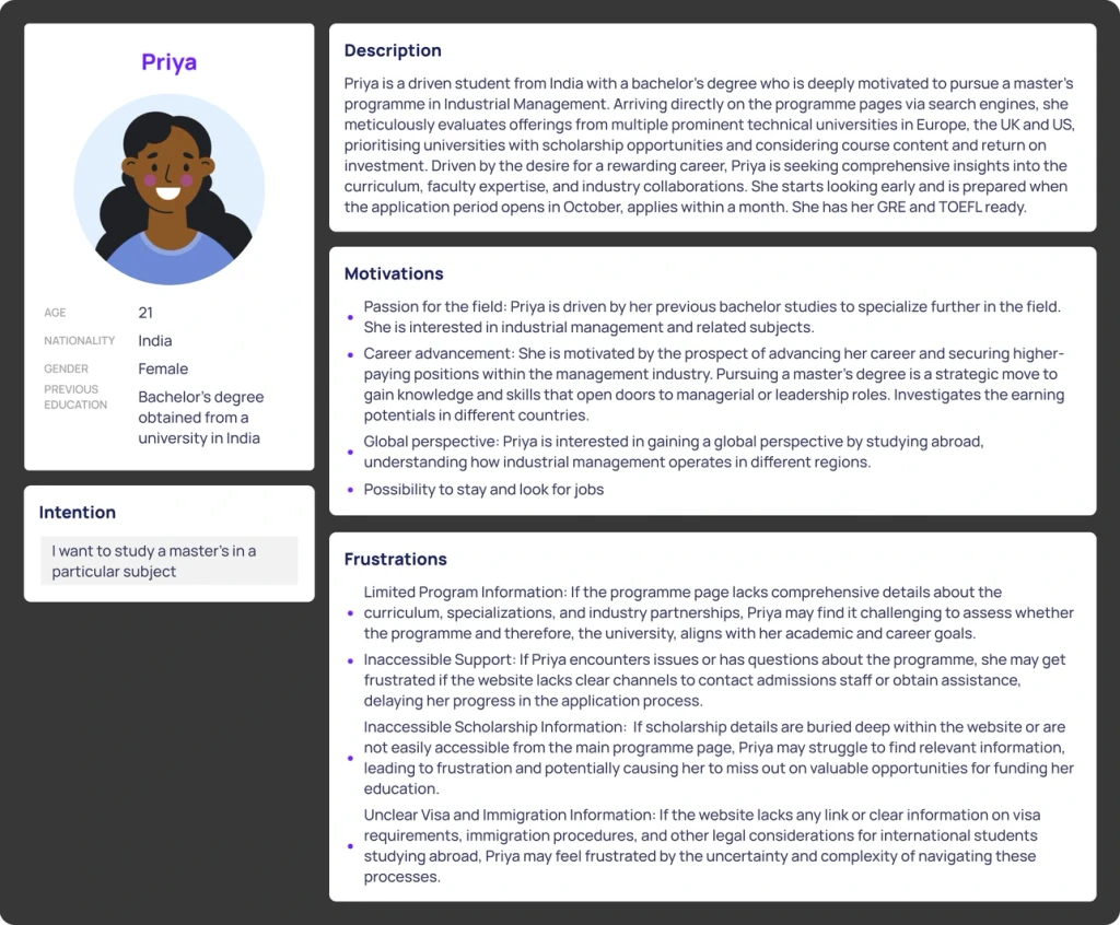
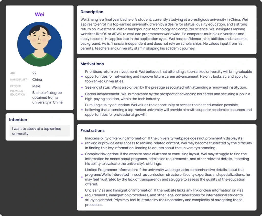
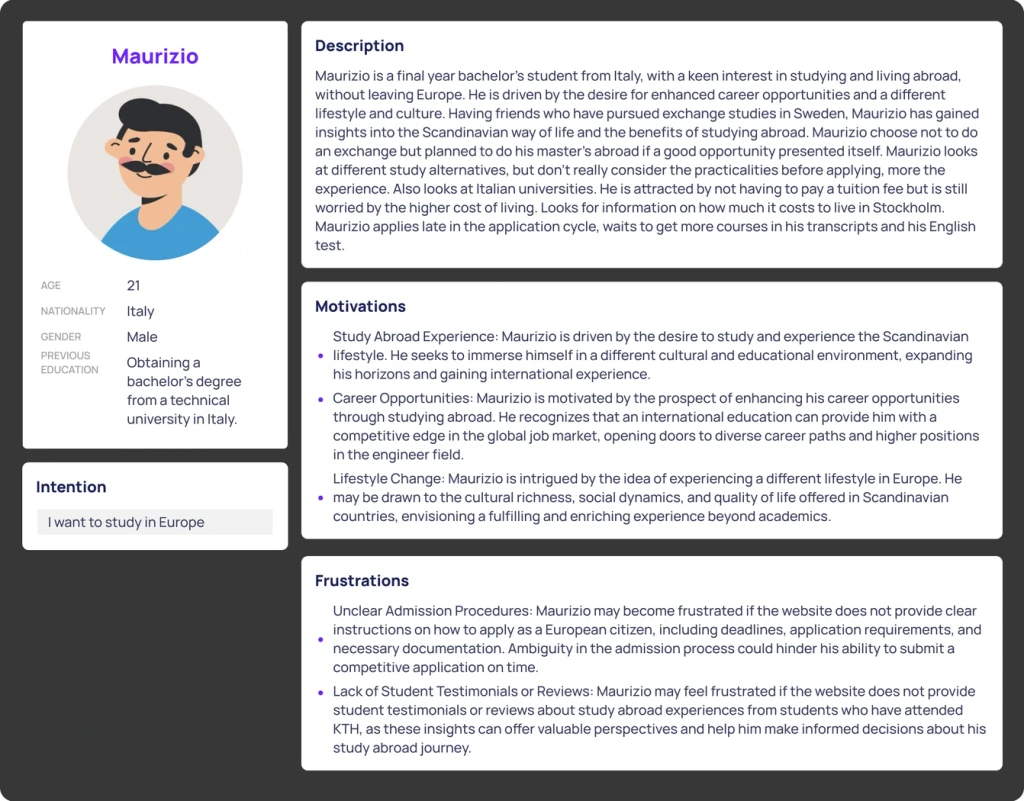
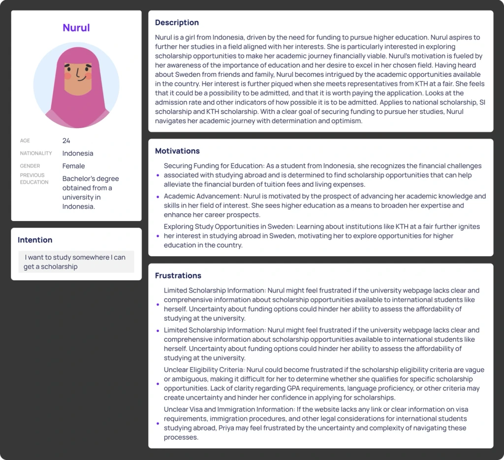
To understand what does/doesn't lead to student conversion, 2 workshops were conducted with over 20 students at KTH to understand their user journey. Based on their insights and usability journey, user personas were created and defined.
Definition
Clear and well-thought-out routes need to get into and out of the web from other activities (for example portals, ranking lists, …)
Information is available in the place in the structure where it is requested and where it make sense in relation to the other content.
It is close to related content, preferable 1 or 2 logical clicks. All content should be within a maximum of 3 clicks or 1 page search.
Noise is reduced in the navigation to avoid leading the visitor away from the intended path.
What should the solution answer to?
After establishing the structure, we formulated specific questions to address as we developed new flows and interaction menus.
1. What content do prospective students want?
2. Programme specific and general.
3. What content do our key personas expect?
4. What content can we provide?
5. What content related to areas of science and engineering do we not cover?
6. What content do our competitors provide?
7. Extra focus on career information, what related to this could we improve?
Navigation Prototyping
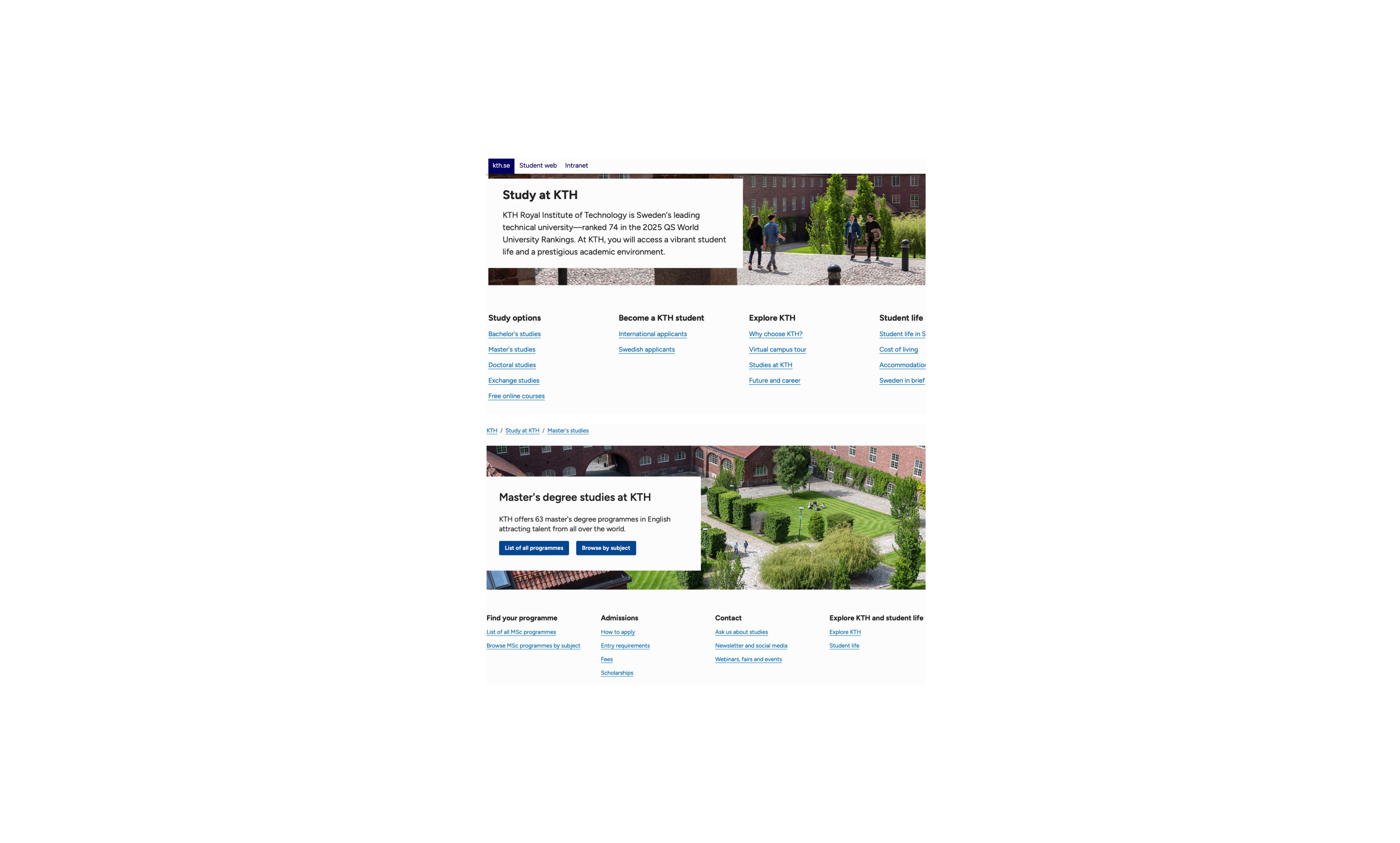
Next, we began prototyping navigation options to help prospective students find the information they need more quickly and easily. Simultaneously, we re-evaluated the content structure on each informational page to create a clear reading path for students, avoiding information overload.
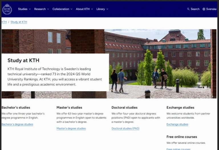
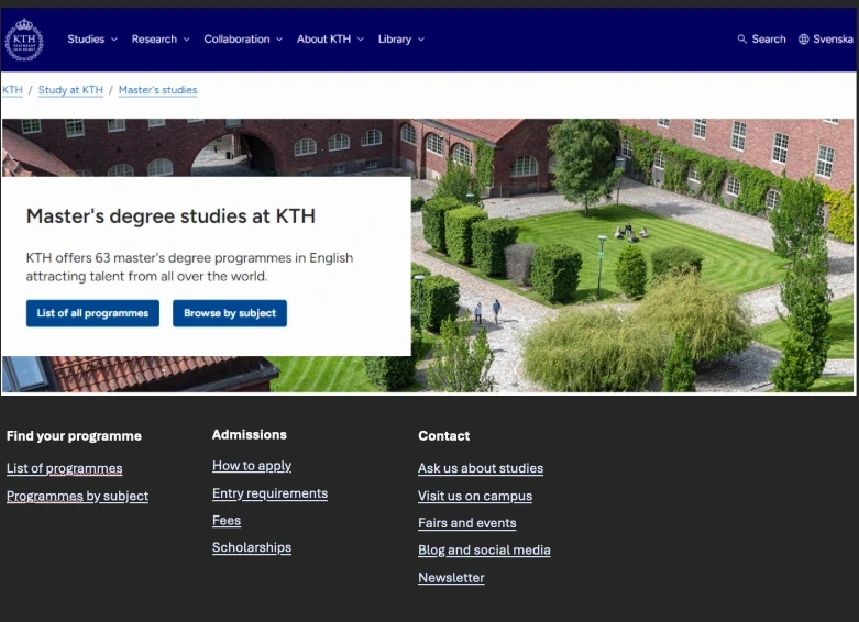
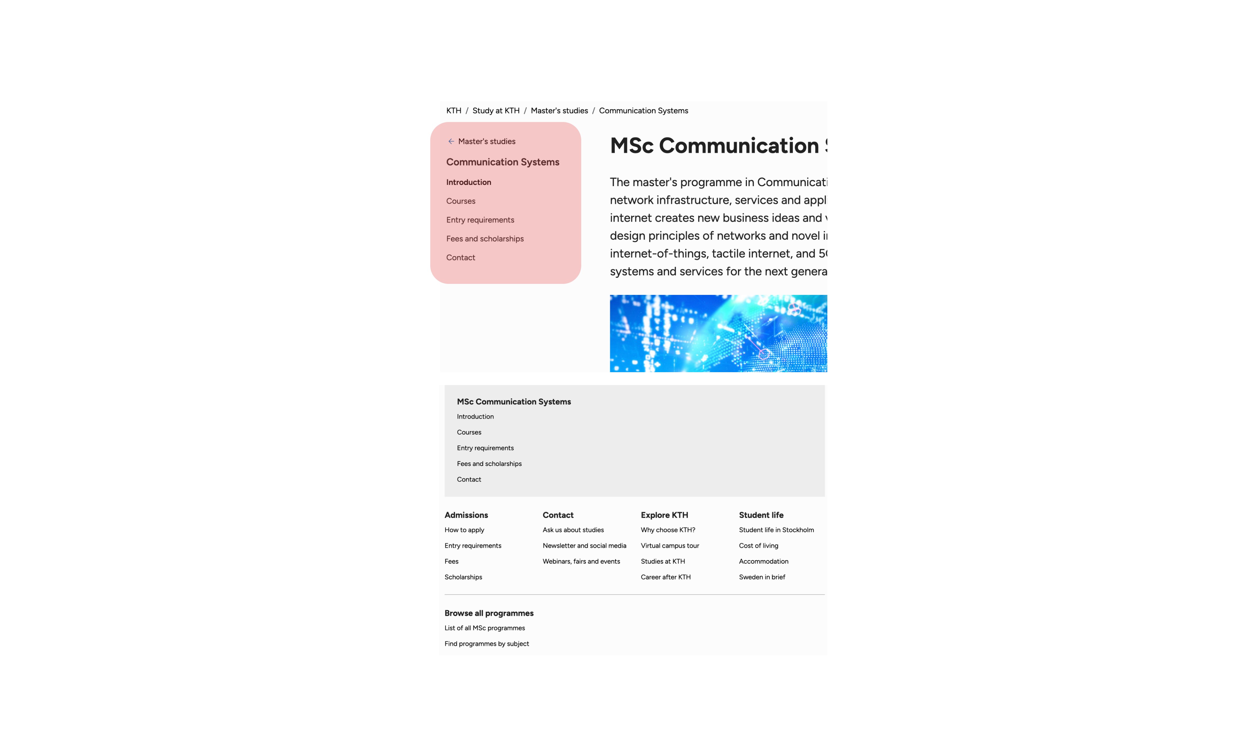
Old Navigation
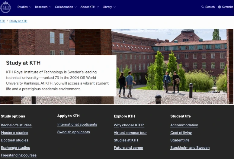
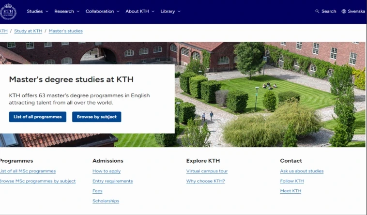
New Navigation
Old Navigation
New Navigation
Testing
After we created the Test pages in Polopoly(CMS for KTH website), a workshop was conducted with current KTH students that fit the profile of each one of the user personas. With this, we would ensure their needs where being met.
The participants where required to perform the Think-aloud method in order for the team to gather insights as to what were their current preferences where with the new and old navigation methods. Some comments gathered were the following ⬇️
Pooja
- Prefers Linkedin over graduate interviews, and also student interviews.
- The programmes are the most important, and then the cost of living
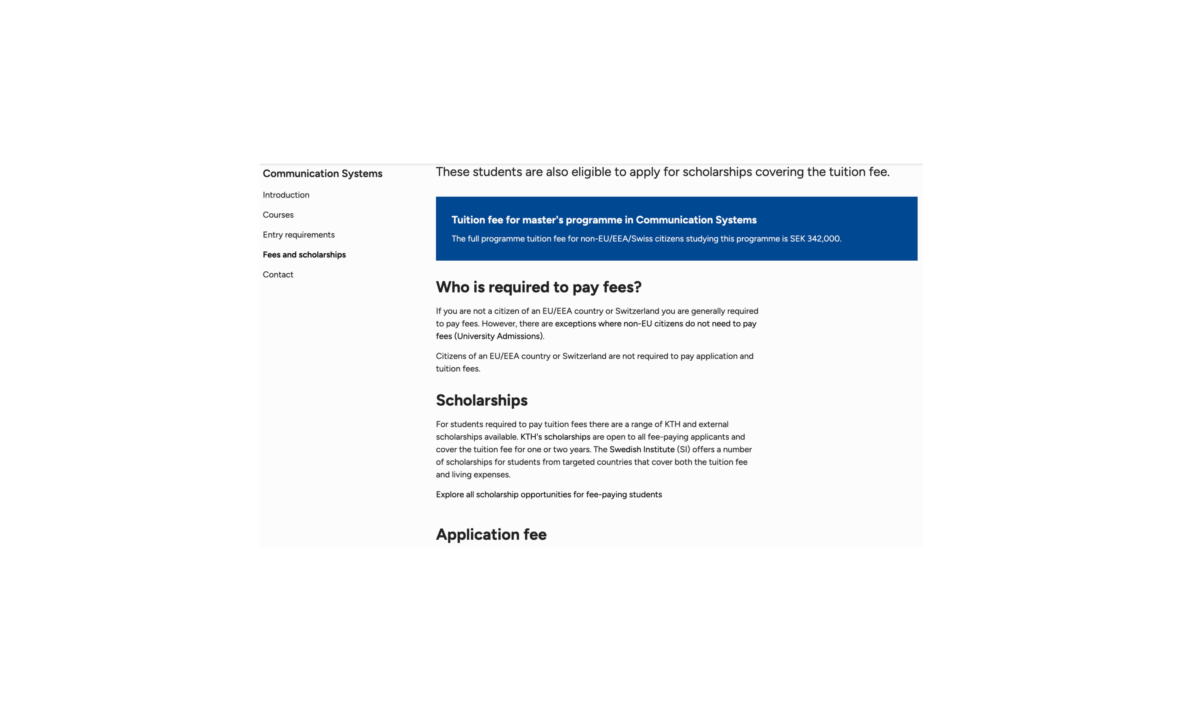
- “Fees and scholarships” could be one page
- “Possibly combine “Blogs, SOME and newsletter” (we could skip newsletter as a menu item
- Promote campus visits less
- Move “Future and career” up in the menu
- Connect with a KTH student under student life (would not work as Student life is general for all levels and Ask is specific to master)
- Connect with a KTH student in country order would be interesting
- Signing up for a webinar recording is totally fine
- Styling looks nice on the website, compared to other universities
Francesco
- Courses are important – they should be highlighted more with fewer menu items
- “Accommodation is no programme specific”
- Highlight the programmes as much as possible.
- Not interested in events etc before the application.
- How to apply can be more visible
- Would be fun to have webinar recordings behind a “paywall”
- Possibly student interviews under contact?
- Link from Fees to Scholarships and possibly rename fees to “Fees and scholarships”
- A lot of back and forth between University Admissions website, possibly less information on the KTH website and send traffic to UniversityAdmissions
- Generally, the website is really good, especially when comparing with others
Zi Cing
- She would be attracted if we had more visuals, videos or realistic photographs.
- Scholarship information should always be paired with Fees and Tuition.
- She wants to know which Collaboration with Companies KTH has.
- Regarding courses, she prefers a table presentation. She gets stressed by having to click on all the links.
- Study exchange is a very attractive thing for her that KTH offers! You can study anywhere during your second year.
- As an International fee paying student is very important for me to know if International students have had jobs after graduation
- She liked the first puff in the programme page. "Its important for me to know when should i start applying”
Muhammad
- Free courses and Meet at KTH is quite “vague”, the text should be maybe more indicative.
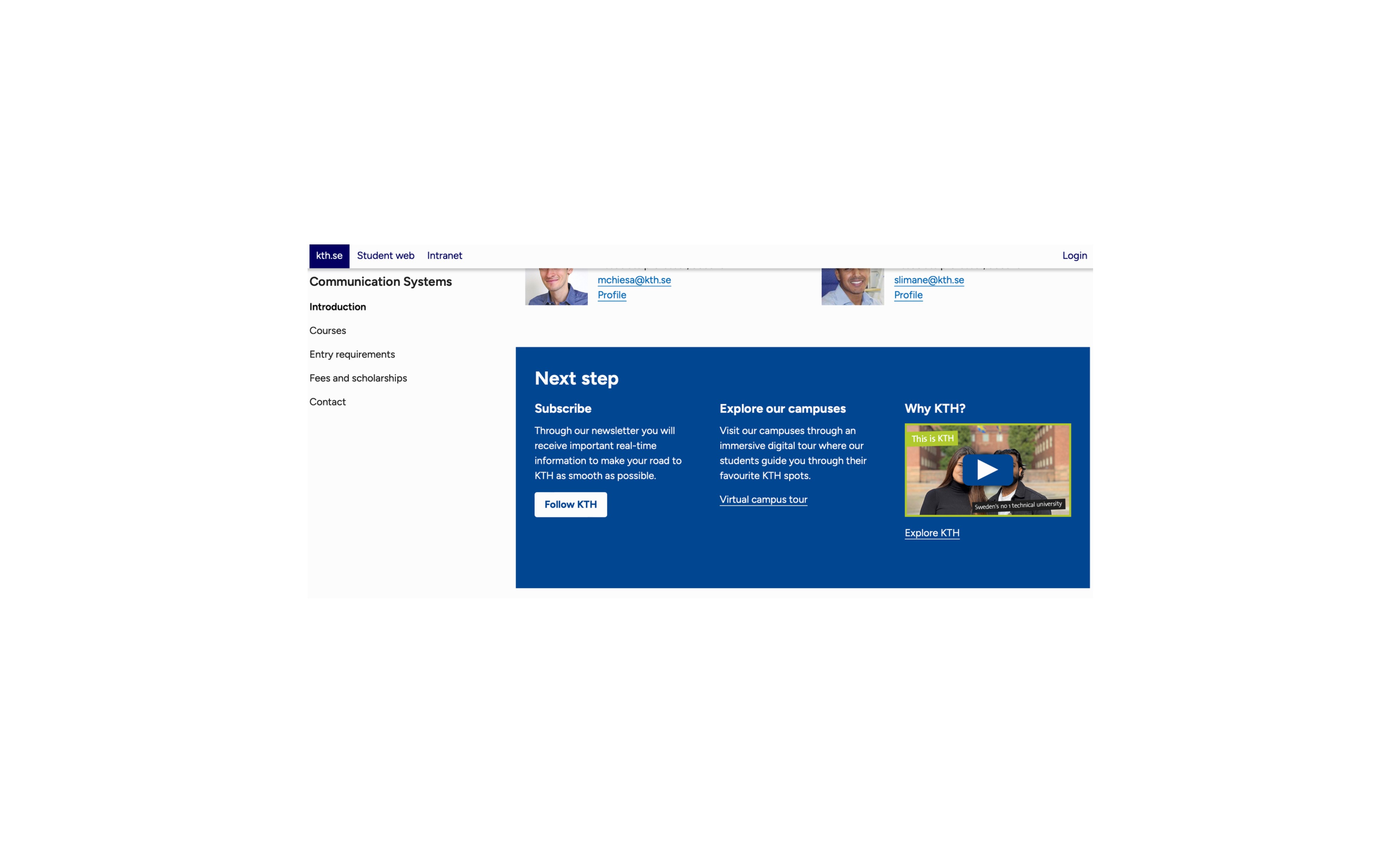
- Explore KTH should always be positioned in the first landing page.
- He prefers the New format of the menu links, he believes is better to have all the information displayed in the main menu rather than having it hiding on the back of a link.
- He asked if we could have more realistic photos of the labs or classrooms?
- Extracurricular activites at KTH, where are they?
- Promote more Campus Visits
- Scholarships is one of the first things an international student wants to see.
